Topic: Caption is cut off in smaller windows and on mobile

Hello,

We are trying to set up an image slider for our website, but we've noticed that in smaller windows, and especially on mobile, the caption is cut off, while the image is resized correctly. Is there any way to prevent this from happening?

Here is a test site we have made that has an example of the slider on it:
http://www.sheddaquarium.org/juicebox-test

Here is what it looks like when the window is full-size:
https://i.imgur.com/4DQqYpB.png

Here is what it looks like when we shrink the window (the text is cut off):
https://i.imgur.com/AYLAxMq.png

We would love to put captions on our sliders, but we don't want them to be cut off for users. Are there any options I am missing?

Thank you!

Re: Caption is cut off in smaller windows and on mobile

I notice that you define your gallery dimensions using percentages (which is absolutely fine) but in your web page, depending on the size of the browser window, your gallery can be quite small (and there simply may not be enough space to display the full image caption).

However, here are a few suggestions which may help.

(1) You could maybe increase the initial size of your gallery on your web page (by increasing the size of your gallery's parent container). This would allow more room for the captions.

(2) I notice that your gallery currently uses screenMode="LARGE". On mobile devices (especially in portrait orientation), your gallery is displayed with limited width (and little room for the captions). If you were to set screenMode="AUTO" (the default value for this configuration option), then the Splash Page would initially be displayed on mobile devices and, when the Splash Page is tapped, the gallery would expand to fill the viewport, giving the captions more room.

(3) Your gallery currently uses captionPosition="BELOW_IMAGE". This limits the caption's width to match that of the image. If you were to set captionPosition="OVERLAY" or captionPosition="BOTTOM" instead, then the caption's width will span the entire stage (giving the captions more room when the gallery is displayed in desktop browsers).

(4) When using captionPosition="BELOW_IMAGE" (as your gallery currently does), Juicebox-Pro will use the maxCaptionHeight value as the actual (fixed) height for the caption area. If you want to continue using captionPosition="BELOW_IMAGE", then you could increase maxCaptionHeight (to a value greater than its default value of 120) to increase the height of the caption area.

(5) You could actually display your captions outside your gallery by fetching the current image's caption via the Juicebox-Pro API (specifically the getImageInfo() method) and then using JavaScript to display the caption elsewhere on your page (perhaps in a container below your gallery).
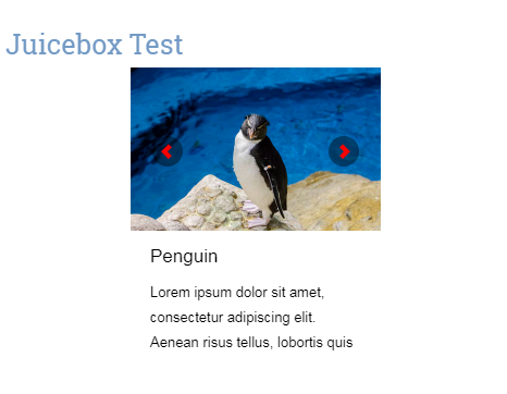
Here's an example of how this could be achieved. To see it in action, just create a sample gallery with JuiceboxBuilder-Pro (making sure to give your images some sample captions) and use the following code as your gallery's 'index.html' page.

<!DOCTYPE html>
<html lang="en">
    <head>
        <meta charset="utf-8" />
        <meta name="viewport" id="jb-viewport" content="width=device-width, initial-scale=1.0, minimum-scale=1.0, maximum-scale=1.0, user-scalable=0" />
        <style type="text/css">
            body {
                margin: 0px;
            }
        </style>
        <script type="text/javascript" src="jbcore/juicebox.js"></script>
        <script type="text/javascript">
            function escape(input) {
                return input.replace(/&/g, '&amp;').replace(/'/g, '&apos;').replace(/>/g, '&gt;').replace(/</g, '&lt;').replace(/"/g, '&quot;');
            }
            var jb = new juicebox({
                containerId: "juicebox-container",
                galleryHeight: "400",
                galleryWidth: "600"
            });
            jb.onImageChange = function(e) {
                var id = e.id;
                var info = jb.getImageInfo(id);
                var caption = escape(info.caption);
                $('#output').html('<p>' + caption + '</p>');
            };
        </script>
        <title>Test</title>
    </head>
    <body>
        <div id="juicebox-container"></div>
        <div id="output"></div>
    </body>
</html>

I hope you're able to incorporate one or more of these suggestions into your own gallery's web page.

Re: Caption is cut off in smaller windows and on mobile

Thank you Steven! This sounds very helpful, appreciate the quick response. I'll experiment and follow up!

Re: Caption is cut off in smaller windows and on mobile

You're welcome!
I hope you get on OK with the suggestions.

Re: Caption is cut off in smaller windows and on mobile

Hi Steven,

No luck so far, although we haven't been able to implement the 5th option yet. We're thinking we're just going to avoid captions for now.

Re: Caption is cut off in smaller windows and on mobile

If you want to try suggestion #5 (to display the captions outside the gallery) but are having problems implementing it, then perhaps you could create a test page with your work-in-progress and post the URL to it so that I can take a look at what you've got so far and hopefully help further. Thank you.

Re: Caption is cut off in smaller windows and on mobile

Hi Steven, here is the current test page. We've reduced the captions for now, which does help with the issue.

Another question, is there a way to reduce the space that currently appears below the Juicebox gallery and the next header? I've looked through the options, but couldn't find something that had an effect. Thanks!

http://www.sheddaquarium.org/juicebox-test

Re: Caption is cut off in smaller windows and on mobile

Here are a few suggestions.

(1) As your gallery uses captionPosition="BELOW_IMAGE", the maxCaptionHeight is used as an absolute value. Try reducing the maxCaptionHeight slightly (as much as possible whilst still being large enough to accommodate your captions).

(2) Give your gallery's caption area a background color (perhaps a slight gradient using either captionBackColor and/or captionBackTopColor ) to reduce the amount of white space between the gallery and the following <div>.

(3) Give the following <div> on your web page a small negative top margin (e.g. style="margin-top: -10px;") to move it up the page slightly.

(4) Just in case your gallery is not completely filling the height of its parent container, try changing your gallery's height from 50% to 100% (and adjust the height of the parent container as necessary) or perhaps to a fixed value such as 600px.

Hopefully one (or more) of these suggestions will help.